How “Vibe Coding” is Changing L&D
By
Cath Ellis
Does your eLearning look like a cheap mismatched add-on? Discover the tools from CSS Peeper to Figma that allow you to clone your client’s branding for a seamless, pixel-perfect user experience.
Reading Time: 5 mins

Imagine you are browsing a sleek, modern corporate website. The fonts are crisp, the buttons have a subtle shadow, and the colours are perfectly balanced.
Then, you click “Start Training.”
Suddenly, you are transported to a beige void with Times New Roman font and blue default buttons. The spell is broken. You have entered “eLearning Hell.”
As designers, our goal is invisibility. The transition from the client’s intranet or website to our course should be seamless. The learner shouldn’t feel like they’ve left the ecosystem.
To achieve this, you need to stop guessing and start cloning. You need to master the art of interpreting Brand Guidelines.
Here is how to ensure your custom themes (in Evolve, Storyline, or Rise) look pixel-perfect every time.
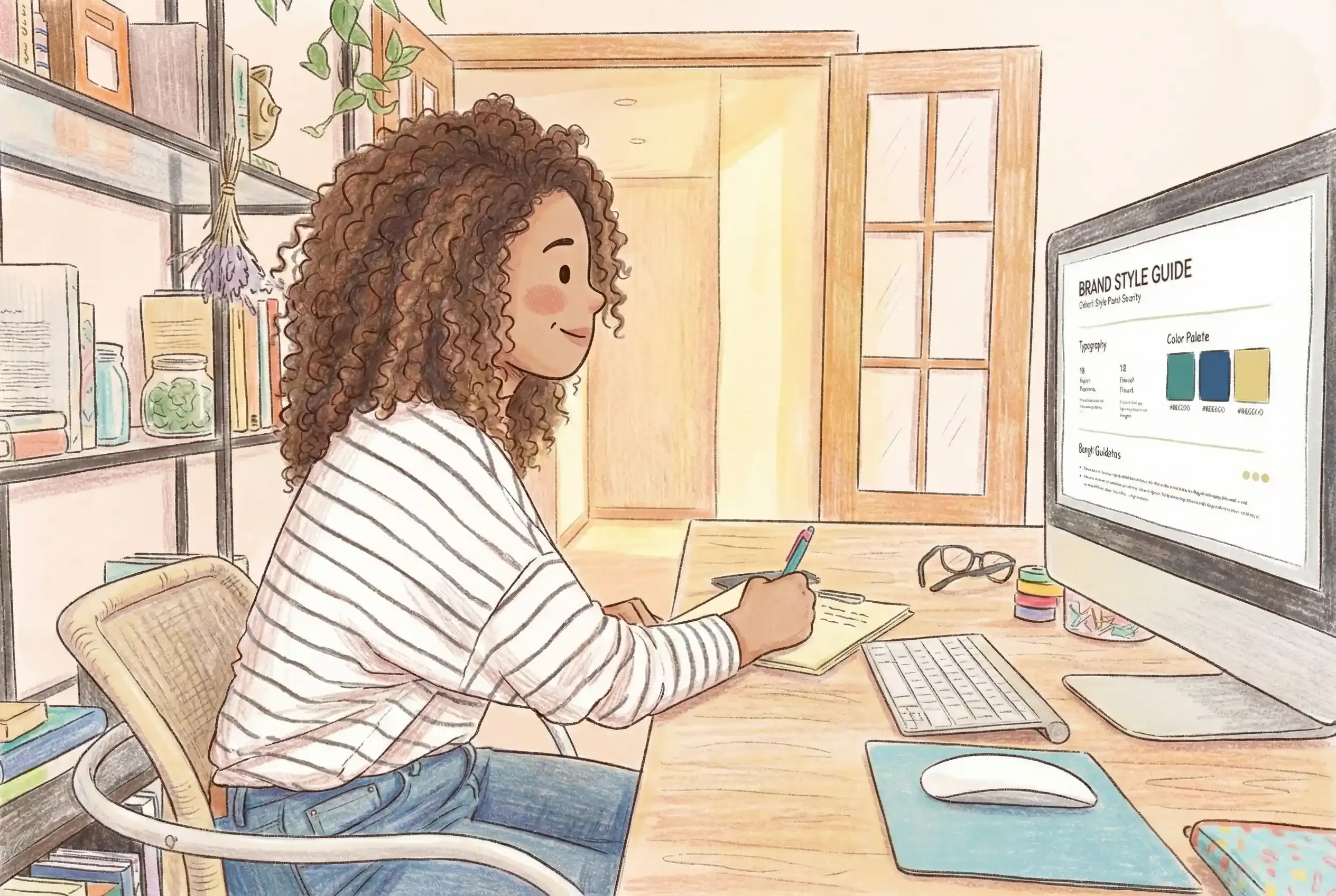
Your first question in the kickoff meeting should always be: “Can you send me your Brand Guidelines or Style Guide?”
This document is the law. It tells you the exact Hex codes for the “Primary Blue” versus the “Secondary Blue.” It tells you which fonts are legal and which are forbidden. It stops you from designing a course that the Marketing Department will inevitably reject.
But what if they don’t have one? Often, a client will say, “We don’t have a guide… just use the logo,” or they send a fuzzy JPEG.
Do not guess. Do not eyeball it. You need to go undercover.
If the client lacks a PDF guide, their website is the guide.
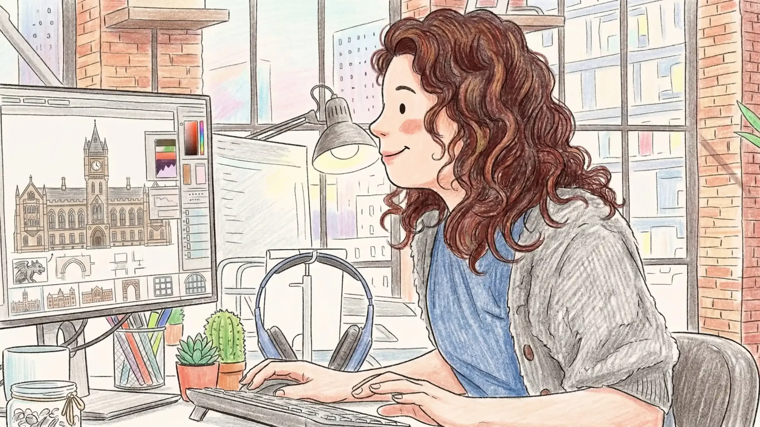
Stop taking screenshots and trying to colour-match in Photoshop. That is the old way. Download a Chrome extension called CSS Peeper.
With one click, you can hover over any element on their live website and see the DNA of their design:
Why this matters: When you build a custom theme in a tool like Evolve, inputting these exact numbers means your course will look indistinguishable from their internal software. That builds instant trust.
Want to blow a stakeholder’s mind during the mock-up phase? Show them a course prototype that looks exactly like their homepage.
I use a plugin for Figma called html.to.design.
The Workflow:
Now, you have their navigation bar, their footer, and their button styles sitting on your canvas. You can use this as a guide, swap the text for your learning content, and present a mock-up that feels incredibly real.
I use this constantly when designing custom themes. It allows me to “borrow” their UI kit legally and ethically to ensure the learner experience is frictionless.
Unless the client specifically asks for a “fresh, unique look” (which is rare), your default setting should be Brand Consistency.
Why?
You are not just an Instructional Designer; you are a Brand Guardian.
Don’t design in a vacuum. Use the tools, CSS Peeper, Figma, and the Style Guide to create a seamless digital thread. When the learner clicks “Start,” they shouldn’t feel a bump. They should just feel like they are home.
Want your courses to look high-end? Book a coaching session with me to learn the UX principles of seamless brand integration in tools like Evolve and Storyline.