Cath Ellis Learning Design Logo

The Strategic Science of Aesthetic Learning Design

Visual design is not decoration, it’s communication. From colour psychology to the architecture of attention, discover how strategic aesthetics reduce cognitive load and turn passive viewing into active learning.

Reading Time: mins

A watercolour illustration of a single eye in the center, with multicoloured rays radiating outward, reflecting the essence of Aesthetic Learning Design.

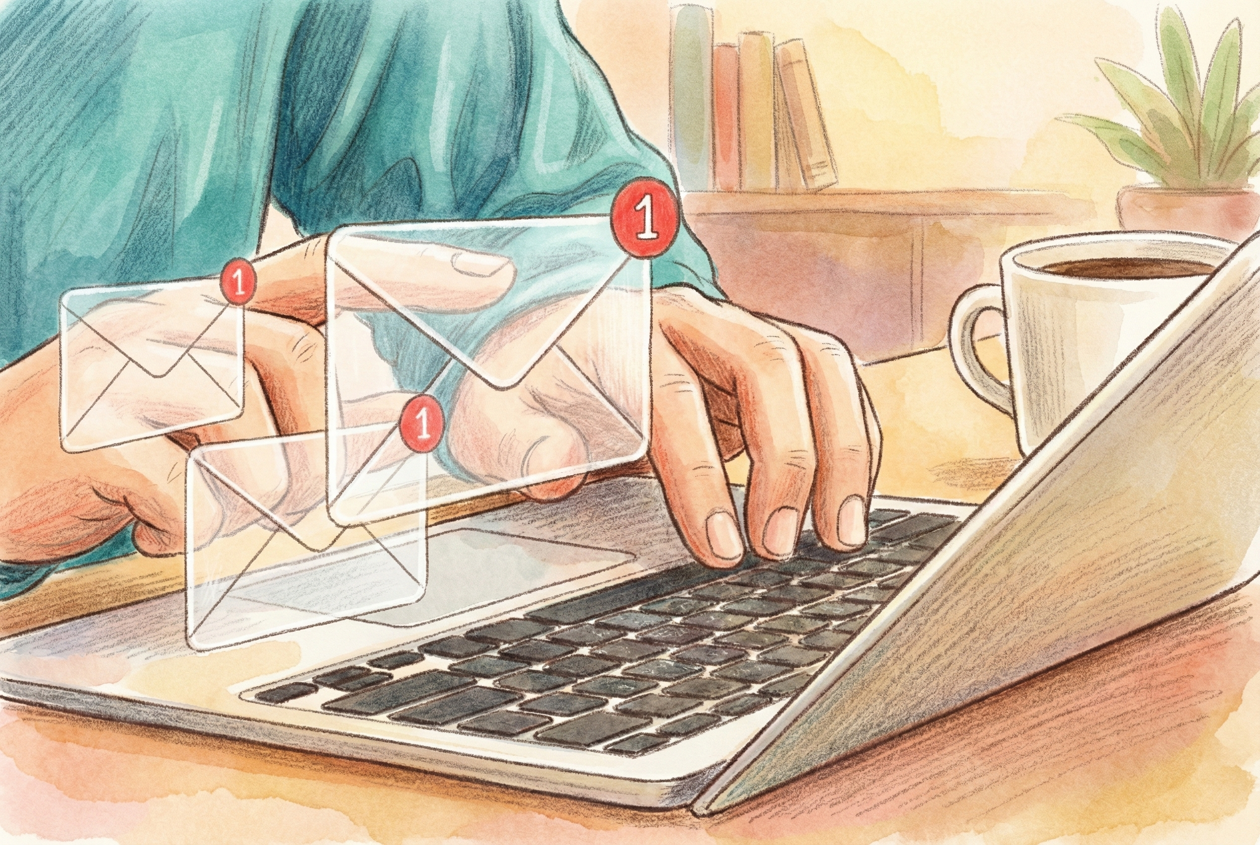
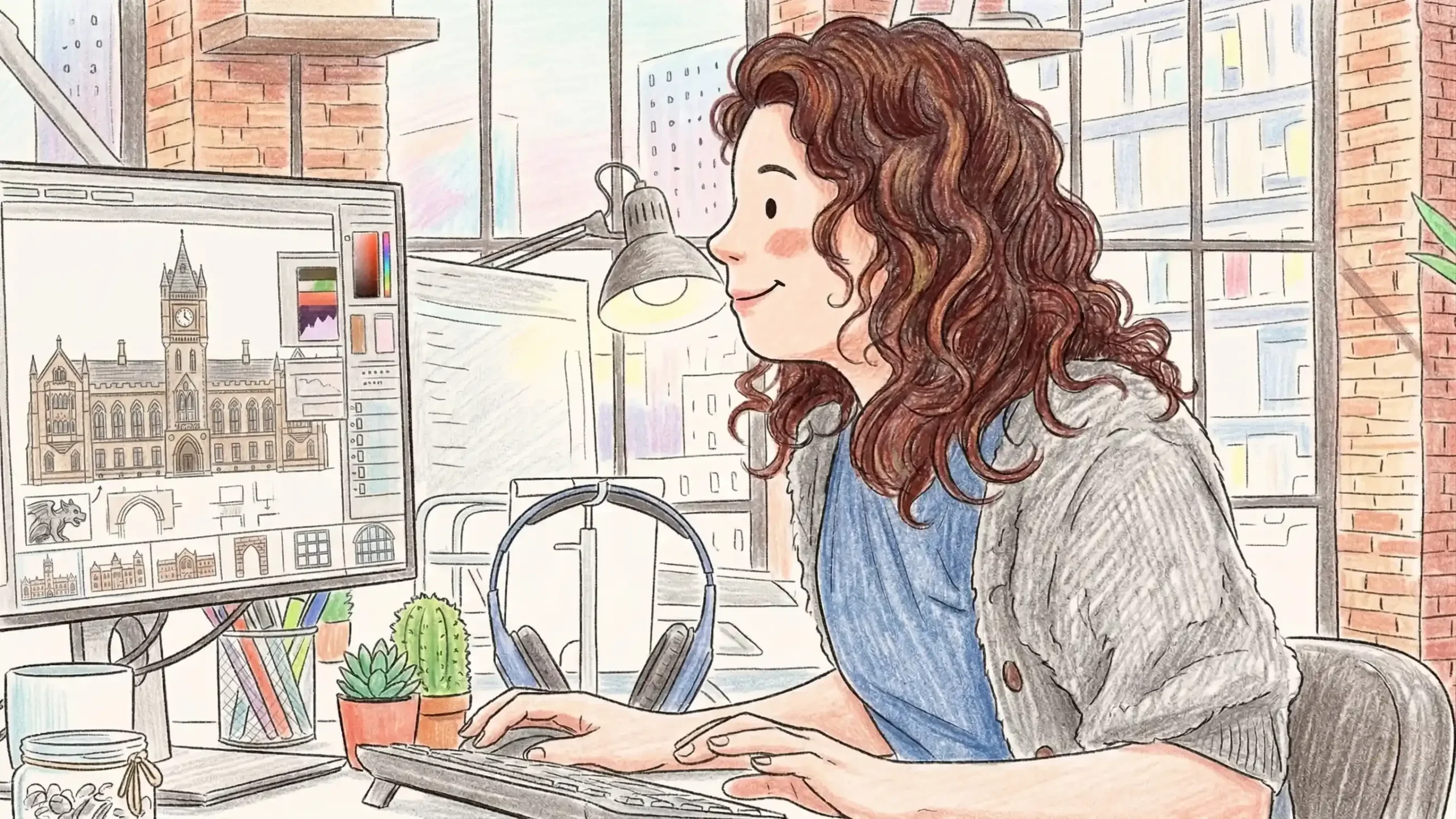
In the world of eLearning, “Make it pop” is a request we hear too often. It implies that visual design is merely the wrapper—a coat of paint applied after the hard work of content creation is done.

This is a dangerous misconception.

Visual design is not decoration; it is communication. It is the non-verbal language that dictates how a learner processes, retains, and applies information. When we talk about aesthetics in learning, we aren’t talking about making things “pretty.” We are talking about reducing cognitive load, directing attention, and triggering the right emotional cues for learning to stick.

Here is how to stop decorating and start designing.

The Psychology of Visual Elements

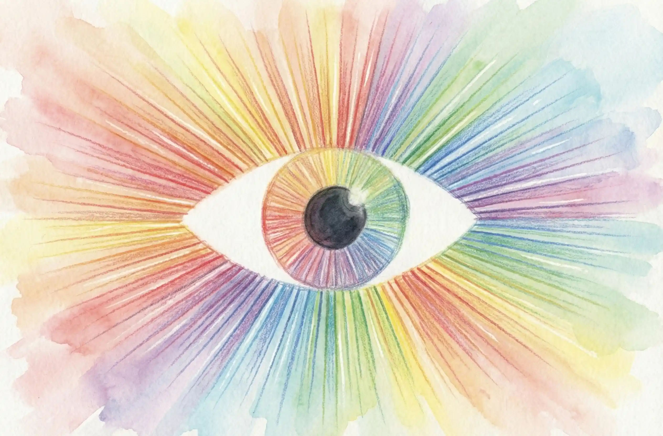
Every pixel on your screen carries psychological weight. Your learners’ brains are decoding these visual cues instantly, long before they read the first word of text.

1. Color: The Emotional Short-Cut Colors are not arbitrary. They are biological signals.

  • Blue: Evokes trust, calm, and stability. Ideal for complex compliance or technical training.
  • Red: Triggers urgency and energy. Use it sparingly for warnings or critical “Don’t Do This” scenarios.
  • Green: Signifies growth and harmony. Perfect for onboarding or progress indicators.
  • The Takeaway: Don’t choose colors based on what you like; choose them based on what you want the learner to feel.

2. Shapes: The Subconscious Guide Shapes influence how we perceive the “personality” of the content.

  • Squares & Rectangles: Suggest stability, balance, and logic.
  • Circles: Imply unity, community, and harmlessness.
  • Triangles: Suggest action, direction, or conflict. They act as arrows, physically pointing the learner’s eye where you want it to go.

3. Typography: The Tone of Voice If your content is the speech, your font is the accent.

  • Serif Fonts: Traditional and reliable. They say, “This is serious, academic, and established.”
  • Sans-Serif Fonts: Modern and clean. They say, “This is accessible, quick, and forward-thinking.”
  • The Takeaway: Legibility is the baseline, but personality is the goal.

The Architecture of Attention: Layout & Hierarchy

If visual elements are the instruments, the layout is the conductor. A chaotic layout creates “visual noise,” which forces the brain to work harder just to figure out where to start. This is wasted cognitive energy.

To fix this, you must master Visual Hierarchy.

Hierarchy is the art of telling the learner’s eye exactly where to look: First, Second, Third. You achieve this through:

  • Scale: Big things matter more.
  • Contrast: Dark text on a light background draws the eye instantly.
  • White Space: This is not “empty space”—it is an active design element. White space allows the content to breathe, reduces overwhelm, and isolates key concepts so they can be absorbed.

Good Design is Inclusive Design

Aesthetics also serve accessibility. High contrast ratios, clear font choices, and logical layouts don’t just help those with visual impairments; they help everyone. A course that is easy to see is a course that is easier to learn.

The Bottom Line

Visual design is a pedagogical tool. It uses diagrams to decode complexity, flowcharts to map logic, and metaphors to bridge knowledge gaps.

As learning designers, we must stop viewing aesthetics as an artistic endeavour and start viewing it as a strategic one.

  • Engage the eye to engage the mind.
  • Clarify the structure to clarify the concept.
  • Respect the learner by making the journey beautiful.

Whether you need a team critique or 1:1 mentorship, book a coaching session with me to master the aesthetics of learning.

Trusted by global brands, government agencies, and industry leaders:

Ready to create something exceptional?

I accept a limited number of projects to ensure every client gets my full attention. Let’s chat about what you need.
Cath Ellis Learning Design Logo
I acknowledge the Wurundjeri People of the Kulin Nation as the Traditional Custodians of the Country on which I live and work.
I honour their enduring connection to land, waters, skies, and community, and pay my deepest respects to Elders past and present, and extend that respect to emerging leaders.
I recognise that sovereignty was never ceded. This always was, and always will be, Aboriginal land.

About Cath Ellis

Cath Ellis is an eLearning Designer and Developer based out of Melbourne, crafting engaging and effective learning experiences.
ABN: 32 316 313 079
A Queer-Owned Business

Contact Info

Join My FREE Community

Sign up for my community to enjoy free eLearning tips, inspiration, and more.
©
2026
Cath Ellis
Made with
in Melbourne